Discovering the Hidden Meanings Behind PlayStation Buttons: A Deep Dive into Gaming History

The Surprising Story Behind PlayStation Buttons
When we think of the iconic PlayStation controller, most gamers immediately picture the familiar buttons that control everything from movement to combat. The triangle, circle, square, and X—each one has become synonymous with PlayStation gameplay. But did you know that the original meaning behind these symbols was something entirely different than what most people assume today?
As gaming evolves, so does our understanding of the hardware that shaped our experiences. The story behind the original PlayStation controller, and especially the significance of its button symbols, offers an intriguing look at the thought process that went into its creation. Teiyu Goto, the designer of the original PlayStation controller, revealed that the meanings behind these buttons were chosen for specific reasons, each one tied to a concept that would enhance the user’s interaction with the game. What may seem like a simple design choice was actually the result of careful thought and intent.
These revelations aren’t just for the most die-hard PlayStation fans; they also highlight the importance of good design in gaming. Goto’s approach to using symbols rather than letters or colors was a bold move that set the PlayStation apart from its competitors. This deeper meaning behind the controller buttons gives us an opportunity to reflect on how design choices, even the smallest ones, can have a significant impact on the way we play and connect with games.
Today, as PlayStation continues to innovate with controllers like the PS5 DualSense, we can still see traces of Goto’s original vision. Understanding these early design principles allows us to appreciate the evolution of gaming technology and the lasting influence of PlayStation’s first steps into the gaming world.

The Hidden Meanings Behind the Buttons
In the world of gaming, the PlayStation controller has always been an integral part of the experience. For many, the symbols on the controller have become second nature, and we rarely pause to consider what they represent. However, the origins of these button designs are far from arbitrary. When Teiyu Goto designed the original PlayStation controller, he wanted to move away from traditional design choices that relied on letters or colors to indicate button functions. Instead, he selected symbols that were simple, memorable, and meaningful.
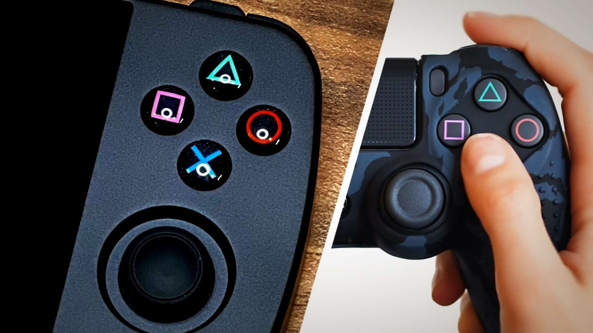
According to Goto, the original meaning behind each button symbol was deeply rooted in the concept of easy recognition. In his interview with Famitsu Magazine, Goto explained that each symbol was chosen to represent a universal concept that would be easily understood by gamers worldwide. The triangle, for example, was meant to symbolize a “viewpoint,” representing a direction or one’s head, and was colored green. The square symbolized a “piece of paper,” referencing menus or documents, and was colored pink. The circle and X, the most well-known buttons for confirming or canceling actions, were assigned meanings tied to decision-making: the circle represented “yes,” and the X represented “no.” They were colored red and blue, respectively, to emphasize their contrasting roles.
This simple yet effective design made the controller easier to navigate, especially for players who were new to gaming. It wasn’t about memorizing letters or numbers; it was about connecting with intuitive, universally understood symbols. This insight into Goto’s thought process reveals a more profound layer to the PlayStation controller’s legacy—one that continues to influence how we interact with gaming hardware today.
Social Media Buzz: What People Are Saying
The news of the hidden meanings behind the PlayStation buttons quickly spread across social media, sparking a wave of reactions from gamers. Many were surprised by the thoughtful design choices that had gone unnoticed for years. The social media posts gave fans a chance to reflect on the nostalgia of playing classic PlayStation games while offering new insights into the history of the console. Let’s dive into some of the engaging posts and comments from Twitter and other platforms.
- User Reaction Post 1:
“I actually never knew this 🙂 thank you for sharing.”
View Tweet
This post highlights the surprise many gamers felt when learning the true meaning behind the controller buttons. It serves as a reminder that even the smallest design elements can have a significant impact on our gaming experiences. - User Reaction Post 2:
“Always thought this was a cool detail of design.”
View Tweet
A more reflective post that showcases how the simplicity of the PlayStation controller’s design made it stand out. It shows how these early decisions in game controller design still resonate with fans today. - User Reaction Post 3:
“This does put stuff in perspective. I can almost feel myself playing the classic games with these setups.”
View Tweet
This comment reveals how the meanings behind the symbols brought a deeper understanding of the PlayStation controller. It brought up a wave of nostalgia for many gamers who remembered playing on the classic PlayStation consoles. - User Reaction Post 4:
“Really wish they would revert back to the circle as YES and X as no. I build muscle memory playing PlayStation, and then it’s a pain to play Nintendo Switch for a couple hours until I get used to it again.”
View Tweet
This user highlights the issue that many gamers face when switching between consoles. Despite the international standardization of the circle as “yes” and X as “no,” this inversion can cause confusion for PlayStation loyalists when they use other gaming systems.
As these posts show, the discovery of the meaning behind the buttons has sparked a deep connection with both long-time fans and newcomers. The power of social media in helping spread this revelation also shows just how intertwined gaming culture is with daily conversations.
The Designer’s Vision
When Teiyu Goto designed the PlayStation controller, he wasn’t just creating a set of buttons for gameplay. He was thinking about how players would interact with the controller and, ultimately, how they would feel while using it. The intention behind the design was to make the controller intuitive, comfortable, and easy to navigate. Rather than relying on traditional design conventions, Goto opted for something more abstract: symbols.
In his Famitsu interview, Goto explained that the use of symbols instead of letters or numbers made the PlayStation controller stand out in a competitive market. At the time, other companies were assigning letters or colors to controller buttons, but Goto believed that symbols would be easier to remember and more universally understood, regardless of language. The triangle symbolized a viewpoint or direction, a simple but powerful representation of movement. The square symbolized a “piece of paper,” reflecting menus or documents, an idea that was perfect for navigating through the PlayStation interface. Meanwhile, the circle and X buttons represented binary choices: yes or no.
By assigning colors to these symbols, Goto further reinforced their meanings. The triangle was green, symbolizing direction or focus, while the square was pink, indicating something static like a document or menu. The red circle symbolized affirmation, while the blue X symbolized negation, offering a clear contrast that would be easy to remember.
Goto’s decision to reinforce his design choices with specific colors and symbols was a game-changer. It added depth and meaning to every button press, making the PlayStation controller not only an essential part of gaming but also an enduring symbol of smart, intuitive design.

The Cultural Impact of Button Design
The PlayStation controller’s design, particularly the button symbols, has left an undeniable mark on gaming culture. Since its inception, PlayStation has maintained its commitment to providing gamers with an intuitive and enjoyable experience. The innovative use of symbols instead of letters set the PlayStation controller apart from others in the industry, creating a unique identity that fans could easily recognize.
As PlayStation’s influence expanded globally, the simple yet effective button design became a cultural icon. It wasn’t just a piece of hardware; it was part of the experience. The buttons themselves—triangle, circle, square, and X—became synonymous with PlayStation’s core philosophy: user-centric design. By using universally recognizable symbols, PlayStation made it easier for players to quickly pick up a controller and start playing, without worrying about memorizing complex button functions.
Moreover, the design choices influenced not just PlayStation consoles but the entire gaming industry. As other companies started to adopt similar principles of simplicity and usability, PlayStation’s vision became the standard. Today, the PlayStation controller is a prime example of how intuitive design can elevate a user’s experience, making it easier for players to get immersed in games without being bogged down by confusing controls.
In this sense, the PlayStation controller became a cultural artifact—something that transcended its functional purpose and became part of the cultural fabric of gaming. Fans and creators alike continue to admire the timeless design that has helped shape the way we engage with video games.
Looking Ahead: The Evolution of Controller Design
The world of gaming hardware is constantly evolving, and PlayStation continues to lead the charge with new innovations. However, while new features such as adaptive triggers, haptic feedback, and motion sensors have become the focal points of modern controllers, the fundamental design principles of the original PlayStation controller remain relevant today.
The thoughtful design of the original PlayStation controller, especially the use of symbols, continues to serve as an inspiration for modern controller designs. As we see new gaming systems and consoles emerge, it’s clear that the foundation laid by Goto and the PlayStation team has set a precedent for intuitive and accessible design in gaming controllers.
For example, the PlayStation 5’s DualSense controller carries forward the idea of creating a more immersive and accessible gaming experience, but it’s the intuitive button layout that remains unchanged. The legacy of the original controller is felt not only in PlayStation’s own products but also across the gaming industry.
Looking ahead, as VR, AR, and other advanced technologies continue to shape gaming, we can be sure that the principles of intuitive design will remain a key part of the conversation. The PlayStation controller’s evolution is a testament to how well-thought-out design can stand the test of time, offering gamers both nostalgia and innovation in every press of a button.
Conclusion: Appreciating the Art of Simplicity
The story behind the PlayStation controller’s design is a powerful reminder of the importance of thoughtful and intentional design. What might have seemed like a simple choice of symbols and colors was actually the product of a vision that sought to improve the player’s experience. Teiyu Goto’s design philosophy laid the foundation for the PlayStation’s success and continues to influence the gaming world today.
As gamers, we often take these details for granted, but understanding the history behind them enriches our experience. Whether you’re a longtime fan or a newcomer, taking a moment to appreciate the simplicity and effectiveness of the PlayStation controller buttons adds a layer of depth to your gaming experience.
For more insights into gaming history and design, explore PlayStation’s rich legacy and learn how the gaming industry has evolved over the years. There’s always more to discover, and every detail matters.
Featured Image Credit: Guven Yilmaz/Anadolu Agency/Getty Images / Matthew Horwood/Getty Images


