
Dark Mode Email Campaigns, Why Adapting to the Trend Matters
With a growing 82% of users opting for dark mode on their smartphones and 83% switching to it on their computers, it’s no surprise that email campaigns should follow suit. As users become more demanding, every detail, from accessibility to aesthetics, matters. One of those critical details is ensuring that your emails are easily readable in both light and dark modes.
If your email design doesn’t adjust properly for Dark Mode, the text could become hard to read, causing recipients to ignore your message altogether. To help you increase engagement and conversion, we’ll break down how to properly transition to Dark Mode and what color inversion entails in email campaigns.
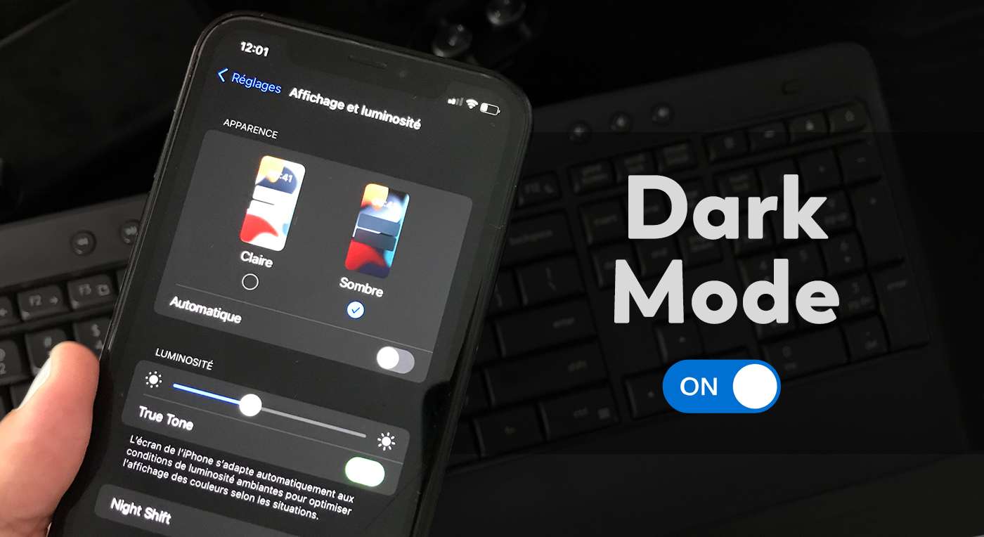
What is Dark Mode in Email Campaigns?
Dark Mode, a popular feature in many email clients, alters the default color scheme when users switch to a nighttime setting. Essentially, Dark Mode inverts the color palette of an email. The email’s light background is replaced with a darker shade, and text and other design elements are shifted to lighter tones.
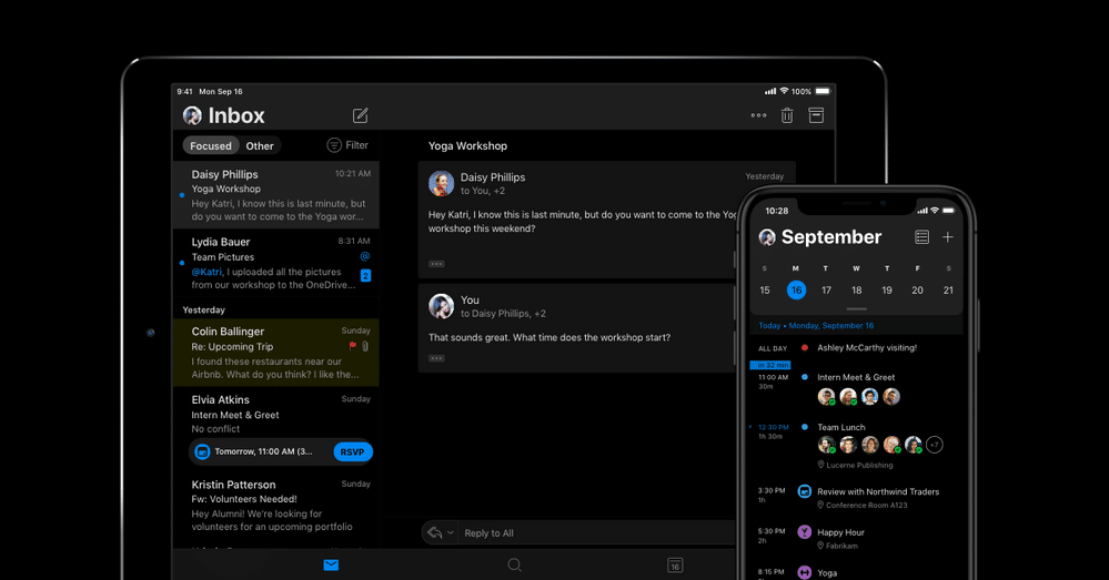
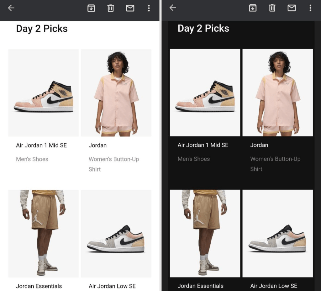
Credits: Emma Email marketing
While it might seem like a major overhaul, color inversion is more about subtle adjustments to enhance readability. The original colors, such as blue or yellow, remain the same, only made brighter or darker to provide better contrast in low-light settings.
Types of Color Inversion in Emails
Depending on the email service provider, Dark Mode’s color inversion can vary. Here’s what to expect:
1. No Changes in Dark Mode
Some email services keep the original design intact, whether the user is in Dark Mode or not. This means that the email will look the same in both settings.
2. Partial Color Inversion
Certain platforms automatically convert light backgrounds into darker shades. However, dark-colored elements, such as black or dark gray, remain unchanged.
3. Full Color Inversion
Full inversion transforms both light and dark elements, optimizing the email for an entirely different look that’s easy on the eyes in dark settings.
Why Adapting Emails for Dark Mode is Important
While it requires an investment of time and coding know-how, adapting your emails for Dark Mode is crucial for several reasons:
User Convenience
Dark Mode’s goal is to reduce eye strain, especially in low-light conditions. Emails that aren’t optimized for dark themes can be uncomfortable to read, as bright and high-contrast text can create discomfort. Ensuring that your email looks just as appealing in Dark Mode will provide a better experience for your recipients.
Aesthetic Appeal
Emails designed with Dark Mode in mind can give off a sleek, sophisticated vibe. A dark background with light text is visually striking and stylish, showing your brand’s attention to detail and current design trends.
Adapting Email Campaigns for Dark Mode Without Code
You don’t need to be a coding expert to adjust your emails for Dark Mode. Here are a few design tips:
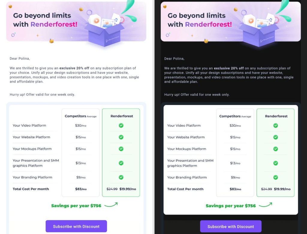
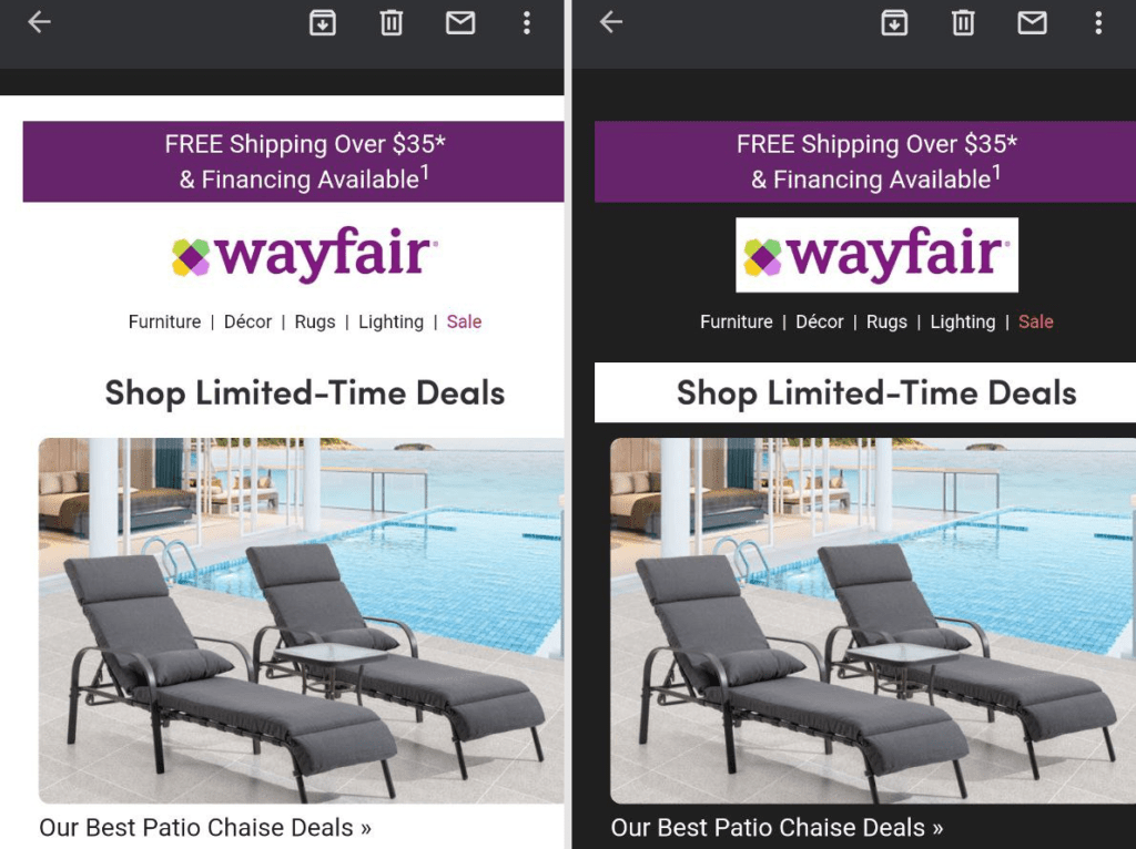
Credits: Medium
Tip 1: Choose Universal Colors
Select colors that work well in both light and dark modes. These should be versatile shades that maintain their visibility and appeal regardless of the display setting.
Tip 2: Use Transparent Backgrounds
Transparent backgrounds prevent extreme contrasts when switching between modes. This way, the email adapts smoothly to Dark Mode without jarring changes.
Tip 3: Save Logos as PNG
Ensure that your brand’s logo and elements are saved as PNG images with no background. This prevents sudden color changes in Dark Mode.
Tip 4: Add Glowing Effects to Dark Elements
To enhance visibility in Dark Mode, use a subtle glow or outline effect around dark-colored elements, such as buttons or text. This will ensure your email stands out.
Tip 5: Embrace Dark Colors from the Start
If dark colors fit your brand’s style, design your emails with dark themes from the outset. This makes the transition to Dark Mode smoother.
Tip 6: Always Test Your Emails
Before sending your campaign, test your emails in both light and dark modes to ensure they look great in either setting.
Inverting Colors Using Media Queries and Meta Tags
If you want to take your Dark Mode adaptation further, using HTML tags such as “supported-color-schemes” and “color-scheme” will help manage the appearance of your emails across both light and dark themes. However, not all email service providers support media queries, so check their technical resources first.
- outlook App for andriod and IOS
- Outlook
- Gmail App for Android and IOS
- Gmail
- Mail.ru
- Yandex.Mail
- iphone and ipad Mail
Conclusion
Adapting to Dark Mode isn’t just a trend—it’s a practical solution for improving user experience and email engagement. By following these tips and understanding the mechanics of color inversion, you can create email campaigns that are both stylish and functional, helping you connect with customers more effectively. With more users opting for Dark Mode every year, it’s time for brands to stay ahead of the curve and enhance their email marketing strategy.