“Walmart Unveils New Logo, but Can You Spot What’s Different?”

Walmart’s bold logo update sent ripples across the internet. The multinational touted it as a “comprehensive brand refresh” highlighting its evolution as a tech-powered retailer. But upon unveiling, the changes appeared subtle: a slightly wider spark and a refined “True Blue and Spark Yellow” palette. Social media erupted with skepticism. “How much did this cost? $10M?” quipped one user, while others mocked the consulting firm behind it. Despite the humor, Walmart’s CMO remained steadfast: “This refresh reflects our timeless commitment to customers.” In the end, Walmart’s refreshed look proved one thing: even the smallest tweaks can spark big conversations.
Credits: Getty
When Walmart announced a sweeping “brand refresh,” excitement filled the air. The retail giant, known for its deep roots in Bentonville and its mission to help people save money and live better, promised a modernized logo that reflected its evolution. However, when the unveiling finally happened, the internet’s reaction wasn’t what they expected. What seemed like minor changes ignited a storm of hilarious commentary, proving that even the smallest updates can cause the biggest stir.
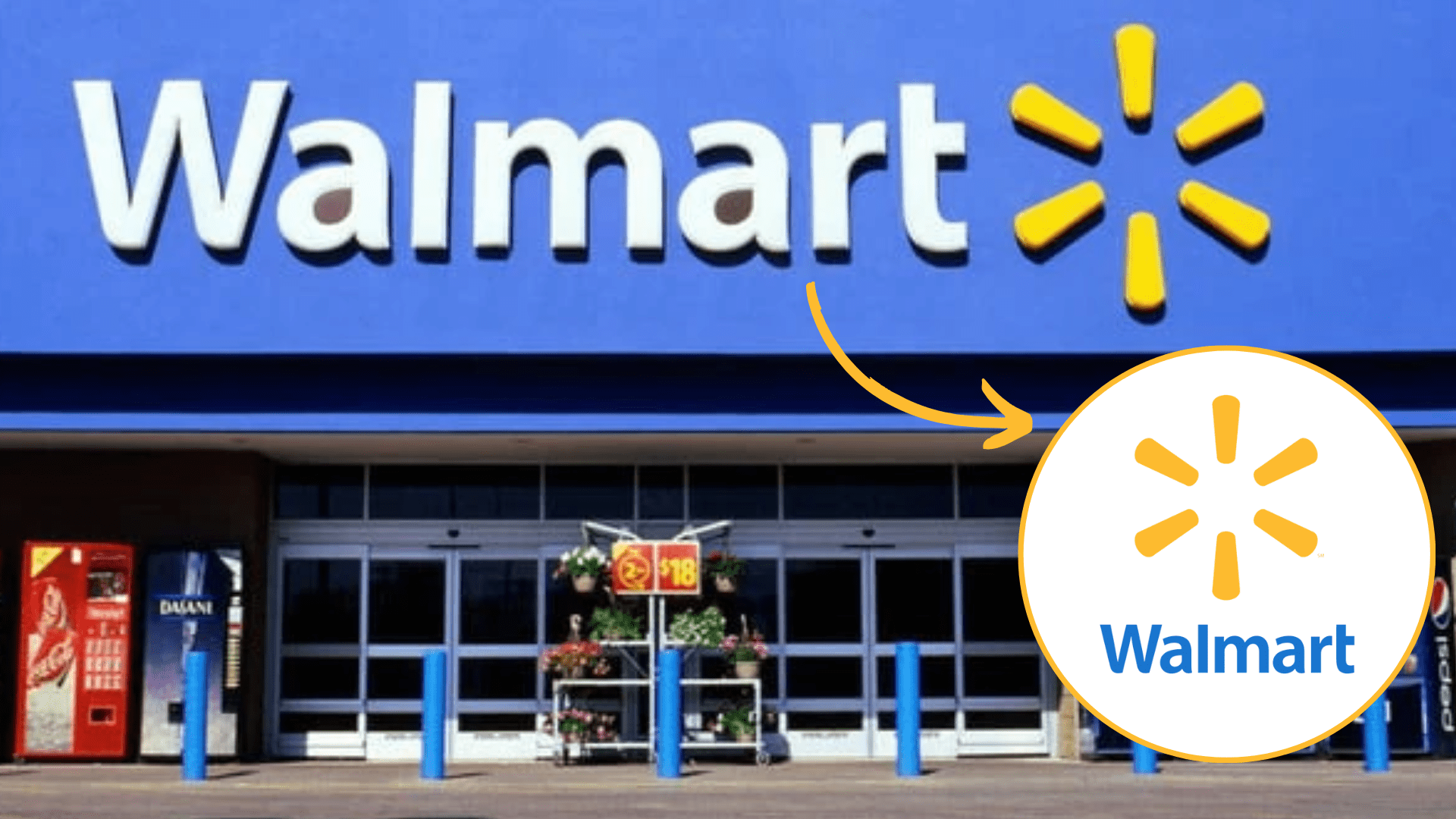
The old logo (left) vs. the new logo (right) – can you tell what’s changed? (Walmart)
A Bold Announcement with Subtle Changes
Walmart proudly introduced its updated logo, describing it as part of a “comprehensive brand refresh.” The company highlighted its refined color palette, now “True Blue and Spark Yellow,” and slight adjustments to its iconic spark design. While the changes were modest, Walmart emphasized their significance in reflecting a modern, people-led, and tech-powered identity.
Social Media Reacts: “How Much Did This Cost?”
Once the new design was revealed, social media had a field day. Users humorously speculated about the budget behind the refresh, with comments like, “Did they spend $10M or $100M on this?” Another joked, “A consulting firm probably made $500M off this ‘refresh.’” The internet’s sharp wit turned the subtle redesign into a viral moment.
Leadership Defends the Refresh
Amid the skepticism, Walmart’s Chief Marketing Officer, William White, stood by the decision. He explained, “Our refreshed identity is a testament to how we evolve alongside our customers.” The company also emphasized how the update would enhance its digital-first services and cultural relevance.
The Big Takeaway: Small Changes, Big Conversations
Despite the mixed reactions, one thing is clear—Walmart’s subtle tweaks sparked an outsized reaction. The logo refresh became a reminder that even the smallest design choices can capture the world’s attention, for better or for laughs.
People had a laugh at Walmart’s so-called ‘brand refresh’ on Twitter.
Final thoughts
Walmart’s brand refresh may not have drastically altered its iconic logo, but it succeeded in creating a buzz. While some see it as a clever modernization, others view it as an overly subtle and costly move. Regardless of the divided opinions, one thing is certain: even a slight design change can ignite widespread discussion and keep a global brand in the spotlight.
Why do brands like Walmart invest millions in changes that seem so minimal?


